
藤藤每日一练——CSS3制作购物车下拉列表
作者:藤藤 日期:2012-10-31 点击:480
特别声明:如果您喜欢小站的内容,可以点击申请会员进行全站阅读。如果您对付费阅读有任何建议或想法,欢迎发送邮件至: airenliao@gmail.com!或添加QQ:874472854(^_^)
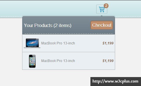
这个案例主要展示的是使用CSS3实现一个购物车清单下拉列表的效果,在整个效果制作过程中没有过多的技术难题,主要一点是使用什么方法来实现下拉列表的隐藏与显示效果,在本例中还是通过max-height来实现的,至于其他的效果,我想大家要是一路跟着藤藤走下来了的话都非常熟悉了,如果你没有跟着练习也不用害怕,这些效果无外呼包括了gradient制作渐变、box-shadow制作阴影,@font-face实现icon等等。
HTML CODE
<ul class="clearfix">
  <li>
    <a href="#" class="cart"><em>2</em></a>
      <div class="item">
        <ul>
          <li>
             Your Products (2 items)<a href="#" class="checkout">Checkout</a>
          </li>
          <li>
            <a class="items">
              <div class="items_img"><img src="img/mac.png"></div>
              <div class="items_text"><span>MacBook Pro 13-inch<span><em>$1,199</em></div>
            </a>
          </li>
          <li>
            <a class="items">
              <div class="items_img"><img src="img/iphone.png"></div>
              <div class="items_text"><span>MacBook Pro 13-inch</span><em>$1,199</em></div>
            </a>
          </li>
        </ul>
      </div>
   </li>
</ul>
CSS CODE
body {
 background-color:#282828;
}
.demo {
 margin:40px auto 0;
 width: 680px;
 height: 400px;
 background-color:#f2f2f2;
}
.demo > ul:nth-child(1){
 position: relative;
 height: 60px;
 box-shadow: 0 1px 3px rgba(0,0,0,.4);
 background: -webkit-linear-gradient(top,#ddeef0,#c3e1e5);
 background: -moz-linear-gradient(top,#ddeef0,#c3e1e5);
 background: -o-linear-gradient(top,#ddeef0,#c3e1e5);
 background: -ms-linear-gradient(top,#ddeef0,#c3e1e5);
 background: linear-gradient(top,#ddeef0,#c3e1e5);
}
.demo > ul:nth-child(1):after {
 position: absolute;
 content: "";
 bottom: 3px;
 display: block;
 width: 100%;
 height: 1px;
 border-bottom: 1px dashed #fff;
}
.cart {
 position: absolute;
 left:50%;
 top:15px;
 display: block;
 width: 36px;
 height: 30px;
 text-align: center;
 color: #728f93;
 border: 1px solid #a7bdc0;
 border-radius: 3px;
 box-shadow: 0 1px 0 #e6f3f4 inset,0 1px 0 #ddeef0;
}
.cart em {
 position: absolute;
 top:-5px;
 right:-5px;
 font-style: normal;
 display: inline-block;
 width: 14px;
 height: 14px;
 border-radius: 7px;
 border: 1px solid #856045;
 background-color: #bb815c;
 content: "2";
 color: #fff;
 line-height: 14px;
 font-size: 10px;
}
.cart:after {
 display: inline-block;
 font-size: 20px;
 font-family: 'broccolidry';
 font-style: normal;
 font-weight: normal;
 speak: none;
 -webkit-font-smoothing: antialiased;
 content: "\21";
 text-shadow: 0 1px 0 #d6eaec;
 line-height: 30px;
}
.item {
 position: absolute;
 left: 85px;
 top: 50px;
 width: 320px;
 z-index: 100;
 max-height: 0px;
 overflow: hidden;
 -webkit-transition: max-height 0.4s linear;
 -moz-transition: max-height 0.4s linear;
 -o-transition: max-height 0.4s linear;
 -ms-transition: max-height 0.4s linear;
 transition: max-height 0.4s linear;
}
.demo > ul > li:hover .item {
 max-height: 220px;
}
.item ul {
 margin-top: 5px;
 text-shadow: 0 1px 0 #fff;
 border: 1px solid #a8b1b6;
 box-shadow: 0 0 7px rgba(0,0,0,.3),0 1px 0 #ced3d6,0 2px 0 #9ba4a8,0 3px 0 #cbd0d4,0 4px #9aa3a8,0 5px 5px #cfd0d0;
 border-radius: 5px 5px  0 0;
 background-color: #eaeff3;
}
.item ul li {
 line-height: 60px;
 max-height: 60px;
 border-top: 1px solid #a8b0b6;
 box-shadow: 0 1px 0 #fff inset;
}
.item li:nth-child(1) {
 color: #fff;
 font-size: 16px;
 text-shadow: 0 1px 0 rgba(0,0,0,.4);
 padding: 0 5px;
 box-shadow: none;
 border-radius: 3px 3px 0 0;
 border: 1px solid #667078;
 background: -webkit-linear-gradient(top,#7f8d97,#6e7c87);
 background: -moz-linear-gradient(top,#7f8d97,#6e7c87);
 background: -o-linear-gradient(top,#7f8d97,#6e7c87);
 background: -mslinear-gradient(top,#7f8d97,#6e7c87);
 background: linear-gradient(top,#7f8d97,#6e7c87);
}
.item li:nth-child(1):before {
 position: absolute;
 content: '';
 width: 1px;
 height: 1px;
 right: 40px;
 top: -5px;
 margin-left: -5px;
 border: 6px solid transparent;
 border-bottom-color: #7f8d97;
 z-index: 99;
}
.item li:nth-child(1):after {
 position:relative;
 display: block;
 bottom: 3px;
 content: "";
 width: 100%;
 height: 1px;
 border-bottom: 1px dashed #fff;
}
.item li:nth-child(1) .checkout {
 float: right;
 color: #fff;
 text-shadow:0 1px 0 #8e4524;
 padding: 0 5px;
 height: 28px;
 line-height: 28px;
 margin-top: 14px;
 border-radius: 5px;
 border :1px solid #81634d;
 box-shadow: 0 0 3px #a16844 inset,0 1px 0 #8d99a1;
 background-color: #c58f6a;
}
.item li .checkout:hover {
 text-decoration: none;
 box-shadow: 0 0 3px #a76f4b inset,0 1px 0 #949fa6;
 background-color: #cb9876;
}
.items {
 display: block;
 color: #78838a;
 padding: 0 5px;
}
.items:hover {
 color: #78838a;
 text-decoration: none;
 background-color: #fff;
}
.items .items_img {
 float: left;
 width: 60px;
 height: 60px;
}
.items .items_img img {
 width: 58px;
 height: 58px;
 vertical-align: middle;
}
.items_text {
 margin-left: 30px;
 overflow: hidden;
}
.items_text em {
 font-weight: bold;
 color: #82593c;
 float: right;
}
@font-face {
 font-family: 'broccolidry';
 src:url('fonts/broccolidry.eot');
 src:url('fonts/broccolidry.eot?#iefix') format('embedded-opentype'),
     url('fonts/broccolidry.svg#broccolidry') format('svg'),
     url('fonts/broccolidry.woff') format('woff'),
     url('fonts/broccolidry.ttf') format('truetype');
 font-weight: normal;
 font-style: normal;
}
如需转载,烦请注明出处:http://www.w3cplus.com/demo/cart-dropdown-list.html
Nike Resurrect the Air Vortex From 1985

