
css3标题设计
作者:结一 日期:2012-09-03 点击:687
特别声明:如果您喜欢小站的内容,可以点击申请会员进行全站阅读。如果您对付费阅读有任何建议或想法,欢迎发送邮件至: airenliao@gmail.com!或添加QQ:874472854(^_^)
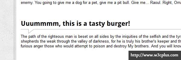
本实例主要是对:before及:after的应用,比较初级,浅显易懂,适合入门。第一个使用border-left和负margin,跟css3没有关系,就是应用了rgba这个属性,使border的颜色有一定的透明值;第二个运用:before和:after生成两个三角叠加起来;第三个背景应用了linear-gradient,然后加上:before和:after生成的三角左右两边各一个;第四个则应用了:after生成元素,然后box-shadow生成阴影,再加上rotate旋转一点角度。这四个虽然比较简单,但是还是非常实用的。
css主要代码:
/*demo1*/
.headline1 {
	border-bottom: 1px dashed #aaa;
	border-left: 7px solid #aaa;
	border-left: 7px solid rgba(0,0,0,.2);
	margin: 0 -15px 15px -22px;
	padding: 5px 15px;
}
/*demo2*/
.headline2 {
	border-bottom: 1px solid #aaa;
	margin: 15px 0;
	padding: 5px 0;
	position: relative;
}

.headline2:before,
.headline2:after{
	content: '';
	border-right: 20px solid #fff;
	border-top: 15px solid #aaa;
	bottom: -15px;
	position: absolute;
	left: 25px;
}

.headline2:after{
	border-top-color: #fff;
	border-right-color: transparent;
	bottom: -13px;
	left: 26px;
}
/*demo3*/
.headline3{
  position: relative;
  margin-left: -22px; /* 15px padding + 7px border ribbon shadow*/
  margin-right: -22px;
  padding: 15px;
  background: #e5e5e5;
  background: -moz-linear-gradient(#f5f5f5, #e5e5e5);
  background: -webkit-gradient(linear, left top, left bottom, from(#f5f5f5), to(#e5e5e5));
  background: -webkit-linear-gradient(#f5f5f5, #e5e5e5);
  background: -o-linear-gradient(#f5f5f5, #e5e5e5);
  background: -ms-linear-gradient(#f5f5f5, #e5e5e5);
  background: linear-gradient(#f5f5f5, #e5e5e5);
  -webkit-box-shadow: 0 -1px 0 rgba(255,255,255,.8) inset;
  -moz-box-shadow: 0 -1px 0 rgba(255,255,255,.8) inset;
  box-shadow: 0 -1px 0 rgba(255,255,255,.8) inset;
  text-shadow: 0 1px 0 #fff;
}

.headline3:before, .headline3:after{
  position: absolute;
  left: 0;
  bottom: -6px;
  content:'';
  border-top: 6px solid #555;
  border-left: 6px solid transparent;
}

.headline3:before{
  border-top: 6px solid #555;
  border-right: 6px solid transparent;
  border-left: none;
  left: auto;
  right: 0;
  bottom: -6px;
}
/*demo4*/
.headline4{
	position: relative;
	border-color: #eee;
	border-style: solid;
	border-width: 5px 5px 5px 0;
	background: #fff;
	margin: 0 0 15px -15px;
	padding: 5px 15px;
	-moz-box-shadow: 1px 1px 1px rgba(0,0,0,.3);
	-webkit-box-shadow: 1px 1px 1px rgba(0,0,0,.3);
	box-shadow: 1px 1px 1px rgba(0,0,0,.3);
}

.headline4:after
{
	content: "";
	position: absolute;
	z-index: -1;
	bottom: 15px;
	right: 15px;
	width: 70%;
	height: 10px;
	background: rgba(0, 0, 0, .7);
	-webkit-box-shadow: 0 15px 10px rgba(0,0,0, .7);
	-moz-box-shadow: 0 15px 10px rgba(0, 0, 0, .7);
	box-shadow: 0 15px 10px rgba(0, 0, 0, .7);
	-webkit-transform: rotate(2deg);
	-moz-transform: rotate(2deg);
	-o-transform: rotate(2deg);
	-ms-transform: rotate(2deg);
	transform: rotate(2deg);
}
查看更多:http://www.red-team-design.com/cool-headings-with-pseudo-elements
nike free run 5.0 nz

