
css3面包屑设计
作者:结一 日期:2012-09-02 点击:1272
特别声明:如果您喜欢小站的内容,可以点击申请会员进行全站阅读。如果您对付费阅读有任何建议或想法,欢迎发送邮件至: airenliao@gmail.com!或添加QQ:874472854(^_^)
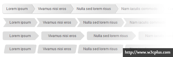
这里总共有四种面包屑效果,其中第一种运用:before和:after,运用border生成同等大小的尖角,叠加起来左右错动1px;第二个还是运用:before和:after,运用border生成不同的尖角,一个在左一个在右;第三个是运用一个:after生成一个正方形,设置border-radius然后rotate旋转45度;第四个直接运用水平扭曲就skewX就可以了。
css主要代码:
/*demo1*/
#breadcrumbs-one{
  background: #eee;
  border-width: 1px;
  border-style: solid;
  border-color: #f5f5f5 #e5e5e5 #ccc;
  border-radius: 5px;
  box-shadow: 0 0 2px rgba(0,0,0,.2);
  overflow: hidden;
  width: 100%;
}

#breadcrumbs-one li{
  float: left;
}

#breadcrumbs-one a{
  padding: .7em 1em .7em 2em;
  float: left;
  text-decoration: none;
  color: #444;
  position: relative;
  text-shadow: 0 1px 0 rgba(255,255,255,.5);
  background-color: #ddd;
  background-image: linear-gradient(to right, #f5f5f5, #ddd);
}

#breadcrumbs-one li:first-child a{
  padding-left: 1em;
  border-radius: 5px 0 0 5px;
}

#breadcrumbs-one a:hover{
  background: #fff;
}

#breadcrumbs-one a::after,
#breadcrumbs-one a::before{
  content: "";
  position: absolute;
  top: 50%;
  margin-top: -1.5em;
  border-top: 1.5em solid transparent;
  border-bottom: 1.5em solid transparent;
  border-left: 1em solid;
  right: -1em;
}

#breadcrumbs-one a::after{
  z-index: 2;
  border-left-color: #ddd;
}

#breadcrumbs-one a::before{
  border-left-color: #ccc;
  right: -1.1em;
  z-index: 1;
}

#breadcrumbs-one a:hover::after{
  border-left-color: #fff;
}

#breadcrumbs-one .current,
#breadcrumbs-one .current:hover{
  font-weight: bold;
  background: none;
}

#breadcrumbs-one .current::after,
#breadcrumbs-one .current::before{
  content: normal;
}

/*demo2*/
#breadcrumbs-two{
  overflow: hidden;
  width: 100%;
}

#breadcrumbs-two li{
  float: left;
  margin: 0 .5em 0 1em;
}

#breadcrumbs-two a{
  background: #ddd;
  padding: .7em 1em;
  float: left;
  text-decoration: none;
  color: #444;
  text-shadow: 0 1px 0 rgba(255,255,255,.5);
  position: relative;
}

#breadcrumbs-two a:hover{
  background: #99db76;
}

#breadcrumbs-two a::before{
  content: "";
  position: absolute;
  top: 50%;
  margin-top: -1.5em;
  border-width: 1.5em 0 1.5em 1em;
  border-style: solid;
  border-color: #ddd #ddd #ddd transparent;
  left: -1em;
}

#breadcrumbs-two a:hover::before{
  border-color: #99db76 #99db76 #99db76 transparent;
}

#breadcrumbs-two a::after{
  content: "";
  position: absolute;
  top: 50%;
  margin-top: -1.5em;
  border-top: 1.5em solid transparent;
  border-bottom: 1.5em solid transparent;
  border-left: 1em solid #ddd;
  right: -1em;
}

#breadcrumbs-two a:hover::after{
  border-left-color: #99db76;
}

#breadcrumbs-two .current,
#breadcrumbs-two .current:hover{
  font-weight: bold;
  background: none;
}

#breadcrumbs-two .current::after,
#breadcrumbs-two .current::before{
  content: normal;
}

/*demo3*/
#breadcrumbs-three{
  overflow: hidden;
  width: 100%;
}

#breadcrumbs-three li{
  float: left;
  margin: 0 2em 0 0;
}

#breadcrumbs-three a{
  padding: .7em 1em .7em 2em;
  float: left;
  text-decoration: none;
  color: #444;
  background: #ddd;
  position: relative;
  z-index: 1;
  text-shadow: 0 1px 0 rgba(255,255,255,.5);
  border-radius: .4em 0 0 .4em;
}

#breadcrumbs-three a:hover{
  background: #abe0ef;
}

#breadcrumbs-three a::after{
  background: #ddd;
  content: "";
  height: 2.5em;
  margin-top: -1.25em;
  position: absolute;
  right: -1em;
  top: 50%;
  width: 2.5em;
  z-index: -1;
  transform: rotate(45deg);
  border-radius: .4em;
}

#breadcrumbs-three a:hover::after{
  background: #abe0ef;
}

#breadcrumbs-three .current,
#breadcrumbs-three .current:hover{
  font-weight: bold;
  background: none;
}

#breadcrumbs-three .current::after{
  content: normal;
}
查看更多:http://www.red-team-design.com/css3-breadcrumbs
jordans for sale ebay

