
十个CSS小技巧
作者:大漠 日期:2011-11-09 点击:508
特别声明:如果您喜欢小站的内容,可以点击申请会员进行全站阅读。如果您对付费阅读有任何建议或想法,欢迎发送邮件至: airenliao@gmail.com!或添加QQ:874472854(^_^)
最近一直在整理一些CSS的知识,稍加整理放上来与大家分享,希望对有需要的朋友有所帮助,别的不说,感兴趣的就接着往下看吧:
一、默认边框植
通常我们写一个元素的border属性会这样的写:
border: border-width border-style border-color;
例如“border:3px solid #000;”我们将元素的边框值设置为3px的黑色实线边框效果,然而这里唯一需要的值是“border-style”,因此,你要是这样写边框样式将会没有任何效果:
.elm {border: 3px red;}
此时浏览器将“border-style”解析成“none”。如果你这样设置又是一个不同的效果:
.elm {border: solid;}
此时元素的边框是实线效果,粗线将是其默认值。但是,什么是其默认值呢?边框border-width的默认值是“medium(大约等于3px~4px)”;而其默认颜色border-color将和字体颜色是一样的。
前段时间在群里也看到有人说border不设置边框时只需设置为border:0,至此我强烈建议按下面的方法设置:
.elm {border: none 0;}
二、纯CSS制作Popups
前面我们一起看过纯CSS制作的ToolTips,那么CSS制作Popups和他的原理是一样的:
<a href="http://www.meyerweb.com/eric/css/">Links<img src="eric.gif" alt="" /></a>
样式如下:
		div#links a img {height: 0; width: 0; border-width: 0;}
		div#links a:hover img {position: absolute;top: 190px; left: 55px; height: 50px; width: 50px;}
详细的介绍大家可以点击Eric的Pure CSS Popups和Pure CSS Popups 2。
三、不用Hack的垂直居中
垂直居中的制作给大家平时的制作中总是带来不少的麻烦,前面我在《CSS制作图片水平垂直居中》和《CSS制作水平垂直居中对齐》也介绍过相关的解决办法,但或多或少都离不开Hack,今天无意中发现一个蛮好的解决方法:
		<div id="outer">
			<div id="middle">
				<div id="inner">
					any text<br>
					<b>any height</b><br>
					any content, for example generated from DB<br>
					everything is vertically centered<br>
				</div>
			</div>
		</div>
CSS Code
		html{height: 100%;}
		body {height: 100%;}
		#outer {height: 600px; overflow: visible;width: 100%;position: relative;} /* or without overflow */
		#outer[id] {display: table; position: static;}
		#middle {position: absolute; top: 50%;} /* for explorer only*/
		#middle[id] {display: table-cell; vertical-align: middle; width: 100%;position:static;}
		#inner {position: relative; top: -50%} /* for explorer only */
		/* optional: #inner[id] {position: static;} */
上面的方法来自于Vertical Centering in CSS。
四、不让文字围绕浮动的图片
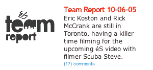
我们有时需要制作图片浮动后,不想让周围的文本内容围绕在图片的周围,就如下图所示:
下面我们来看其实现的代码:
HTML Markup
		<div class="callout">
    	<h3>team report, replaced image</h3>
    	<h2>Team Report 10-06-05</h2>
    	<p>Eric Koston and Rick McCrank are still in Toronto, having a killer time filming for the upcoming éS video with filmer Scuba Steve.</p>
    </div>
CSS Code
		.callout {
    float:left;
    width:275px;
    }
    .callout h3 {
    width:115px;
    height:65px;
    float:left;
    text-indent:-8008px;
    background:transparent url(team-report.gif) no-repeat 0 0;
    }
    .callout * {
    width:160px;
    float:right;
    }
    .callout * * {
    width:auto;
    float:none;
    }
是不是很有创意呀,和你来时制作这样的效果相比,这种方法是不是更为方便呢?如果你想了解更详细的实现原理,你可以点击Image Floats without the Text Wrap。
五、不用图片制作圆角
Web页面中圆角的应用是越来越多,以前是使用图片,现在很多是使用css3的border-radius,但使用图片对于多颜色的圆角制作圆角图片相当麻烦,使用CSS3的border-radius话,IE又是一个很烦人的事情,那么下面我们一起来看一个另类的制作方法:
HTML Markup
		<div class="container">
			<span class="rtop">
				<span class="r4"></span>
				<span class="r3"></span>
				<span class="r2"></span>
				<span class="r1"></span>
			</span>
			<div class="content">Content goes here</div>
			<span class="rbottom">
				<span class="r4"></span>
				<span class="r3"></span>
				<span class="r2"></span>
				<span class="r1"></span>
			</span>
		</div>
CSS Code
		.rtop, .rbottom{display:block}
		.rtop *, .rbottom *{display: block; height: 1px; overflow: hidden}
		.r1{margin: 0 5px}
		.r2{margin: 0 3px}
		.r3{margin: 0 2px}
		.r4{margin: 0 1px; height: 2px}
最终效果就如下所示:

这种方法实现圆角能兼容所有浏览器,也相对来说简单易懂,但就是使用了太多的标签。
六、美化你的有序列表
通过内外设置不同样式,达到有序列表的序列号大于文本内容,如下图所示:
制作上图的效果,我们一起来看个实例代码:

HTML Markup
			<ol>
				<li>
					<p>This is line one</p>
				</li>
				<li>
					<p>This is line one</p>
				</li>
				<li>
					<p>This is line one</p>
				</li>
			</ol>
CSS Code
		ol {
			font: italic 1em Georgia, Times, serif;
			color: #999999;
		}

		ol p {
			font: normal .8em Arial, Helvetica, sans-serif;
			color: #000000;
		}
七、制作渐变文字
制作渐变文字效果,需要一个渐变透明图片的配合,才能实现,具体看下面的制作代码:
THML Markup
<h1><span></span>CSS Gradient Text</h1>
CSS Code
		h1 {
		font: bold 330%/100% "Lucida Grande";
		position: relative;
		color: #464646;
		}
		h1 span {
		background: url(gradient.png) repeat-x;
		position: absolute;
		display: block;
		width: 100%;
		height: 31px;
		}

		<!--[if lt IE 7]>
		<style>
		h1 span {
		background: none;
		filter: progid:DXImageTransform.Microsoft.AlphaImageLoader(src='gradient.png', sizingMethod='scale');
		}
		</style>

		<![endif]-->
效果如下

有关于更多的渐变文字效果的制作,大家还可以参考CSS Gradient Text Effect或者Pure CSS text gradient (no PNGs)。
八、首字下沉
下面我们来看一个首字下沉的制作方法
HTML Markup
<p class="introduction"> This paragraph has the class "introduction". If your browser supports the pseudo-class "first-letter", the first letter will be a drop-cap. </p>
CSS Code
		p.introduction:first-letter {
		font-size : 300%;
		font-weight : bold;
		float : left;
		width : 1em;
		}
我们一起来看看效果吧:

如果你对这个首字下沉效果非常感兴趣的话,你还可以点阅CSS Drop Cap Effect 、Drop Caps、A Simple CSS Drop-Cap和Creating drop caps using css,这几篇教程都介绍了制作首字下沉的效果。
九、显示Firefox的滚动条,删除的textarea在IE浏览器的滚动条
这两个功能可记住,或者直接写入你的base.css文件中,要做到他们在各浏览器下一致的效果,还真沙不了他们:
		html{
		overflow:-moz-scrollbars-vertical;
		}

		textarea{
		overflow:auto;
		}
十、给页面设置最小宽度和最大宽度
在使用流水布局时,常常需要在页面的body或者容器中设置一个最小值,而IE部分版本无法支持这个min-width和max-width,那么我们需要对他们进行特别的处理:
		#container {
    	min-width: 600px;
    	max-width: 1200px;
    	width:expression(document.body.clientWidth < 600? "600px" : document.body.clientWidth > 1200? "1200px" : "auto");

    }
今天又整理了十个CSS的小技巧,希望对大家有所帮助,如果你有什么小技巧,记得告诉我,与我们一起分享。
如需转载烦请注明出处:W3CPLUS
Nike React Element 87

