
Vue 2.0学习笔记:使用Vue创建Modal组件
作者:大漠 日期:2018-01-27 点击:20749
特别声明:如果您喜欢小站的内容,可以点击申请会员进行全站阅读。如果您对付费阅读有任何建议或想法,欢迎发送邮件至: airenliao@gmail.com!或添加QQ:874472854(^_^)
Modal弹框在Web应用或者Web页面上非常常见,很多时候在不同的项目都会重写这样的一个Modal弹框。为了能偷懒,思考了一下,能不能写一个组件,比如说使用Vue创建一个组件,一个Modal组件,让其能在各个Web页面或者应用上使用。在这篇文章中,学习一下如何使用transition和slots来创建可重用的Modal组件。
Modal构成
Modal对于大家来说是很常见的一个东东,在Dribbble上搜索modal可以看到很多非常优秀的Modal设计。比如下面这个:
一般对于Modal弹框会有五个部分构成:

- Modal弹框的蒙层,一般是黑色半透明,全屏显示
- Modal弹框头部
- Modal弹框主体
- Modal弹框脚部
- Modal弹框关闭按钮
这是一个Modal弹框最常见的五个部分,当然不是所有的Modal弹框都会有这些东西。对于以前我们写一个Modal弹框会这样来写:
<div class="modal-backdrop">
    <div class="modal">
        <div class="modal-header">
            <div class="modal-close"></div>
        </div>
        <div class="modal-body"></div>
        <div class="modal-footer"></div>
    </div>
</div>
很多时候在
modal-footer中也会带有关闭弹框的动作按钮,需要具体场景具体分析。
使用Vue创建Modal组件
使用Vue-cli构建项目
在这里我使用Vue-cli来构建Vue的项目,对于Vue-cli在这里不做过多的阐述。通过:
vue init webpack vue-modal
然后一路按照命令提示执行下去。运行npm run dev,你会先看到一个这样的界面:

创建modal组件
找到项目中的src/components/目录,创建一个Modal.vue文件。有了这个组件文件之后,咱们先从组件的模板开始。需要定义出Modal组件常见的几个部位:
<template>
    <div class="modal-backdrop">
        <div class="modal">
            <slot name="header"></slot>

            <slot name="body"></slot>

            <slot name="footer"></slot>
        </div>
    </div>
</template>
注意,这里使用了Vue的slots。这样我们就可以通过props来提供Modal弹框的header、body和footer。因为使用slots可以有更多的灵活性。

使用slots使用我们可以很轻易地重用不同类型的弹框内容。可以在Modal弹框显示一个简单的文本,但是我们可能希望重用相同的Modal弹框来提交一个请求。虽然props一般情况下足够我们构建一个组件,但是通过props会要求我们使用v-html来渲染它。这样做一个不好的地方,很可能会受到XSS的攻击。
在这里,使用不同命名的slots,可以让我们在一个组件中使用多个slots。当定个一个指定的slots时,我们所识别的任何名称都将被呈现,而不是原来的slots。简单的理解,就把它看作是一个占位符。有点类似于input中的placeholder,如果不显式的给slots指定内容,它也可以有默认的内容。
由于所提供的内容将会替换<slot>标记,为了保证<slot>对应的区域有我们想要的类名,最好用一个容器将每个<slot>包裹起来。这个时候我们的模板变成这样:
<template>
    <div class="modal-backdrop">
        <div class="modal">
            <div class="modal-header">
                <slot name="header"></slot>
            </div>

            <div class="modal-body">
                <slot name="body"></slot>
            </div>

            <div class="modal-footer">
                <slot name="footer"></slot>
            </div>
        </div>
    </div>
</template>
给slots添加一点默认的值以及给容器设置一些初始的CSS样式,让其看起来像一个基本的Modal弹框:
<template>
    <div class="modal-backdrop">
        <div class="modal">
            <div class="modal-header">
                <slot name="header">
                <h2>这是Modal弹框的标题</h2>
                <button type="button" class="btn-close" @click="close">x</button>
                </slot>
            </div>

            <div class="modal-body">
                <slot name="body">
                这是Modal弹框的主体
                </slot>
            </div>

            <div class="modal-footer">
                <slot name="footer">
                这是Modal弹框的脚部
                <button type="button" class="btn-green" @click="close">关闭</button>
                </slot>
            </div>
        </div>
    </div>
</template>

<script>
export default {
    name: 'Modal',
    data () {
        return {

        }
    },
    methods: {
        close: function () {
            this.$emit('close');
        }
    }
}
</script>

<style scoped>
    .modal-backdrop {
        position: fixed;
        top: 0;
        right: 0;
        bottom: 0;
        left: 0;
        background-color: rgba(0,0,0,.3);
        display: flex;
        justify-content: center;
        align-items: center;
    }

    .modal {
        background-color: #fff;
        box-shadow: 2px 2px 20px 1px;
        overflow-x:auto;
        display: flex;
        flex-direction: column;
    }
    .modal-header,
    .modal-footer {
        padding: 15px;
        display: flex;
    }
    .modal-header {
        border-bottom: 1px solid #eee;
        color: #4aae9b;
        justify-content: space-between;
    }
    .modal-footer {
        border-top: 1px solid #eee;
        justify-content: flex-end;
    }
    .modal-body {
        position: relative;
        padding: 20px 10px;
    }
    .btn-close {
        border: none 0;
        font-size: 20px;
        padding: 20px;
        cursor: pointer;
        font-weight: bold;
        color: #4aae9b;
        background-color: transparent;
    }
    .btn-green {
        color: #fff;
        background-color: #4aae9b;
        border: 1px solid #4aae9b;
        border-radius: 2px;
    }
</style>
这时你看到的弹框基本效果像这样:

目前一进入页面,Modal弹框就打开了。这并不是我们想要的交互行为。一般情况下,Modal弹框是不显示的,只有用户进行了某个操作行为,才会显示Modal框。咱们在上面的基础上做一下调整。
在App.vue中的template添加一个按钮:
<template>
    <div id="app">
        <button type="button" class="btn" @click="showModal">打开Modal</button>
        <modal v-show="isModalVisible" @close="closeModal" />
    </div>
</template>
在<modal>中使用v-show指令绑定了isModalVisible,而这个isModalVisible默认是一个flase值,只有当button的@click触发了showModal方法时,isModalVisible的值才会变成true。同时<modal>绑定了一个@close事件,这个事件中有closeModal的方法,当这个事件触发时,isModalVisible将又会变回false。这些事情都将在App.vue的<script>中完成:
<script>
    import Modal from './components/Modal.vue'

    export default {
        name: 'App',
        components: {
            Modal
        },
        data () {
            return {
            isModalVisible: false
            }
        },
        methods: {
            showModal: function () {
            this.isModalVisible = true
            },
            closeModal: function () {
            this.isModalVisible = false
            }
        }
    }
</script>
这个时候在你的浏览器中将会看到一个这样的效果:

现在基本上能满足我们要的Modal弹框的需求。但现在点击Modal弹框之外的地方,无法关闭Modal弹框。也就是点击蒙层无法关闭弹框。要实现这样的一个交互行为,咱们得回到Modal.vue组件中,在props添加一个show。并且需要在modal-backdrop中添加一个@click事件,并给这个事件传入close方法,同时需要在.modal中添加@click.stop,以名造成点击弹框任何地方都会关闭Modal弹框。
<template>
    <div class="modal-backdrop" @click="close" v-show="show">
        <div class="modal" @click.stop>
            <div class="modal-header">
                <slot name="header">
                    <h2>这是Modal弹框的标题</h2>
                    <button type="button" class="btn-close" @click="close">x</button>
                </slot>
            </div>

            <div class="modal-body">
                <slot name="body">
                    这是Modal弹框的主体
                </slot>
            </div>

            <div class="modal-footer">
                <slot name="footer">
                    这是Modal弹框的脚部
                    <button type="button" class="btn-green" @click="close">关闭</button>
                </slot>
            </div>
        </div>
    </div>
</template>

<script>
    export default {
        name: 'Modal',
        props: ['show'],
        data () {
            return {

            }
        },
        methods: {
            close: function () {
                this.$emit('close');
            }
        }
    }
</script>
这个时候看到效果如下:

此时你往Modal.vue中添加不同内容时,看到的弹框内容就不一样,比如文章中最早展示的一个Modal弹框效果。上面只是一个最基本的Modal弹框。
添加transitions
现在我们打开Modal弹框的效果是很生硬的,并没有任何动效,也不生动。事实上,在Vue中可以通过<transition>来帮助我们实现这样的效果。
Vue提供了一个<transition>容器组件,它允许我们添加进入和离开的过渡效果。这个容器组件可以用于任何元素或组件,提供了CSS和JavaScript的钩子。
每当一个组件或一个元素由transition插入或删除时,Vue将会检查给定的元素是否有CSS的transition,并在正确的时间添加或删除它们。对于JavaScript的钩子来说也是如此。但是在Modal弹框中,我们使用<transition>的CSS钩子足够了。
Vue的transition提供了六种类来控制元素进入和离开的过渡效果。它们中的每个都将以transition的name名做为前缀来命名。有关于这方面的详细说明,可以查看官方文档。
首先改造一下Modal.vue的模板,在模板中.modal-backdrop外添加一个<transition>容器组件,并在这个容器组件中添加name用来控制进入和离开的过渡效果:
<template>
    <transition name="modal-fade">
        <div class="modal-backdrop" @click="close" v-show="show">
            <div class="modal" @click.stop>
                <div class="modal-header">
                    <slot name="header">
                        <h2>这是Modal弹框的标题</h2>
                        <button type="button" class="btn-close" @click="close">x</button>
                    </slot>
                </div>

                <div class="modal-body">
                    <slot name="body">
                        这是Modal弹框的主体
                    </slot>
                </div>

                <div class="modal-footer">
                    <slot name="footer">
                        这是Modal弹框的脚部
                        <button type="button" class="btn-green" @click="close">关闭</button>
                    </slot>
                </div>
            </div>
        </div>
    </transition>
</template>
现在,添加了一个过渡,让不透明慢慢淡出,使用应用的类:
.modal-fade-enter,
.modal-fade-leave-active {
    opacity: 0;
}

.modal-fade-enter-active,
.modal-fade-leave-active {
    transition: opacity .5s ease
}
你将看到的效果如下:

有关于Vue中的transition更多的介绍可以阅读下面相关的文章:
- Enter/Leave & List Transitions
- State Transitions
- Intro to Vue.js: Animations
- vue2-animate
- Creating Vue.js Transitions & Animation: Live Examples
- Understanding Vue.js Transitions
- 关于Vue2.0的过渡效果与过渡状态
- Vodal: A vue modal with animations.
添加可访问性
为了让Modal弹框更具可访问性,可以通过aria属性来实现这一点。
添加role="dialog"能让读屏软件识别我们的组件是一个应用程序的对话框。它与UI的其他部分分离。虽然添加role="dialog"对我们的Modal弹框是有帮助的,但是它还不足以使Modal弹框变得具有可访问性,我们需要在适当的地方添加一些标记。通过aria-labelledby和aria-bedby属性可以实现这一个目标。
<template>
    <transition name="modal-fade">
        <div class="modal-backdrop" @click="close" v-show="show">
            <div class="modal" @click.stop role="dialog" aria-labelledby="modalTile" arial-describedby="modalDescription">
                <div class="modal-header" id="modalTitle">
                    <slot name="header">
                        <h2>这是Modal弹框的标题</h2>
                        <button type="button" class="btn-close" @click="close" aria-label="Close modal">x</button>
                    </slot>
                </div>

                <div class="modal-body" id="modalDescription">
                    <slot name="body">
                        这是Modal弹框的主体
                    </slot>
                </div>

                <div class="modal-footer">
                    <slot name="footer">
                        这是Modal弹框的脚部
                        <button type="button" class="btn-green" @click="close" aria-label="Close modal">关闭</button>
                    </slot>
                </div>
            </div>
        </div>
    </transition>
</template>
个性化Modal弹框
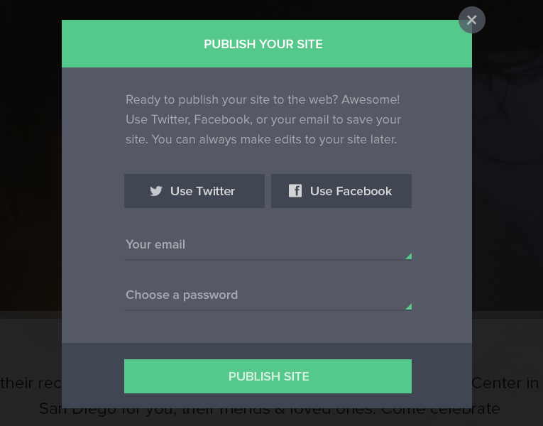
万事具备,现在我们来实现文章开头想要的一个Modal弹框:
<template>
    <div id="app">
        <div class="btn-area">
            <button type="button" class="btn" @click="showModal">打开Modal</button>
        </div>
        <modal v-show="isModalVisible" @close="closeModal">
            <div slot="header">
                <h3>Publish your site</h3>
                <button type="button" class="btn-close" @click="closeModal" aria-label="Close modal">x</button>
            </div>
            <div class="content" slot="body">
                <p>Ready to publish your site to the web? Awesome! Use Twitter, Facebook, or your email to save your site. You can always make edits to your site later.</p>
                <div class="action">
                    <button type="button">Use Twitter</button>
                    <button type="button">Use Facebook</button>
                </div>
                <div class="form">
                    <div class="form-control">
                        <label for="email">Your email</label>
                        <input type="email" placeholder="Your email" id="email" name="email">
                    </div>
                    <div class="form-control">
                        <label for="password">Choose a password</label>
                        <input type="password" placeholder="Choose a password" id="password" name="password">
                    </div>
                </div>
            </div>
            <button type="button" slot="footer" @click="closeModal" aria-label="Close modal" class="btn-green">publish site</button>
        </modal>
    </div>
</template>
这个时候你看到的Modal弹框像这样:

现在可以添加样式了。让你的弹框更美观一点。这里就不聊样式的添加了。
有关于本例的Modal弹框组件的代码可以在VueStudy的vue-modal中获取。如果你对VueStudy感兴趣,可以观注这个项目,如果你愿意分享你的Demo或者组件,也可以向这个仓库提交Requests。
总结
这篇文章整理了怎么使用Vue来创建一个Modal弹框。主要用到了Vue的两个知识点,一个是slots,另一个是transition容器组件。其中slots可以帮助我们构建高可复用性的Modal弹框;transition可以帮助我们Modal弹框出现和离开的时候有一定的动效,不至于效果生硬。
这个Modal弹框还不够强大,个性化的配置不强。随着后续知识点更足之时,将再次完善这个组件。由于本人是Vue的初学者,如果文章中有不对之处,还请各咱大婶斧正。如果你有更好的建议或者作品,欢迎一起分享。
扩展阅读
- Make a Modal using Bootstrap CSS and VueJS
- Vue 2 Transitions:Elegant, reusable Vue 2 transitions
- Composing Reusable Modal Dialogs with Vue.js
- Building a Modal Component with Vue.js

大漠
常用昵称“大漠”,W3CPlus创始人,目前就职于手淘。对HTML5、CSS3和Sass等前端脚本语言有非常深入的认识和丰富的实践经验,尤其专注对CSS3的研究,是国内最早研究和使用CSS3技术的一批人。CSS3、Sass和Drupal中国布道者。2014年出版《图解CSS3:核心技术与案例实战》。
如需转载,烦请注明出处:https://www.w3cplus.com/vue/vue-modal-component.htmlnike free run 5.0 black


