
图解CSS:Grid布局(Part12)
作者:大漠 日期:2021-07-26 点击:414
特别声明:如果您喜欢小站的内容,可以点击申请会员进行全站阅读。如果您对付费阅读有任何建议或想法,欢迎发送邮件至: airenliao@gmail.com!或添加QQ:874472854(^_^)
网格布局中的对齐
我们先从网格布局中的对齐说起。
如果你熟悉 Flexbox 布局 的话,那么你应该知道 Flex 容器中对 Flex项对齐的方法。这些对齐属性最早只是运用于 Flex 容器和 Flex 项目上(也就是 Flexbox 布局中),后来随着 CSS 规范的变革,运用于 Flexbox 中的对齐方式的相关属性被移动一个新的规范中,即 盒模型对齐 Level 3(CSS Box Alignment Module Level 3) 的规范中,这个规范详细的定义了在不同的布局方式下如何处理对齐问题。目前该规范定义的对齐方式主要运用于 Flexbox 布局和 Grid 布局中。
每种布局方式对盒模型对齐规范(CSS Box Alignment)的实现都略有差异,因为实际情况是每种布局方式都有各自的特点以及历史包袱,不能期望在所有的实现方式中都有完美一致的表现(对齐方式的表现)。而我们接下来主要和大家聊的是该规范在 CSS Grid 布局模式下的对齐方式。
特别声明,盒模型对齐规范(CSS Box Alignment)现在是一个独立的模块,在这里只介绍该规范所说的属性在网格容器和网格项目中的运用,更为详细的介绍,将会在新的章节中和大家探讨。
网格布局中的轴线
在介绍网格布局中重要术语的时候,就和大家介绍过网格轴这个术语。在 CSS 网格布局中有两条轴线用于对齐,即 块方向的列轴 和 行方向的行轴。

块方向的轴是采用块布局时块的排列方向。所设页面中有两个段落,其中一个显示在另一个下面,所以这个方向的轴被称为 块方向的轴 。在 CSS 网格布局规范中,它被称为 列轴,因为这条轴的方向和列轨道是一致的。行方向的轴 与块方向的轴垂直,它的方向和普通文本的方向一致。在 CSS 网格规范中,它有时被称为 行轴,因为这条轴的方向和行轨道是一致的。
我们可以把网格区域中的内容,以及网格轨道整体与这两条轴线对齐。
网格布局中的对齐方式
盒模型对齐规范中的属性在 CSS 网格布局也将按这两条轴来划分:
- 运用于“对齐项目到块方向列轴”的对齐属性有:
align-items和align-self,其中align-items运用于网格容器上,align-self运用于网格项目上 - 运用于“对齐项目到文本方向行轴”的对齐属性有:
justify-items和justify-self,其中justify-items运用于网格容器上,justify-self运用于网格项目上 - 运用于“对齐项目轨道到块方向的列轴”的对齐属性有:
align-content,该属性运用于网格容器上 - 运用于“对齐项目轨道到文本方向的行轴”的对齐属性有:
justify-content,该属性运用于网格容器上
也可以按下面这样的方式来划分:
- 对齐网格项目:
justify-items和justify-self沿着行轴对齐网格项目,而align-items和align-self沿着列轴对齐网格项目,其中justify-items和align-items被运用于网格容器,而justify-self和align-self被运用于网格项目 - 对齐网格轨道:
align-content沿行轴对齐网格轨道,justify-content沿着列轴对齐网格轨道,它们都被运用于网格容器
接下来,我们来看看这些盒模型对齐属性在网格布局中的使用,但这里并不会详细的阐述,更详细的介绍将放到独立的章节中来阐述。
网格项目的对齐
我们先从网格项目的对齐开始。
justify-items和justify-self会使网格项目沿着行轴(文本方向的行轴)来设置网格项目在网格项目所在网格区域中对齐方式align-items和align-self会使网格项目沿着列轴(块方向)来设置网格项目在网格项目所在网格区域中对齐方式
justify-items 和 align-items 运用于网格容器上,它们可接受的值有:
autonormalstartendcenterstretchbaselinefirst baselinelast baseline
比如下面这个示例:
.grid__container {
    display: grid;
    grid-template-rows: 80px 80px;
    grid-template-columns: 1fr 1fr;

    justify-items: var(--justify-items, auto);
}
默认情况之下,网格项目i1 并未使用明确放置网格项目相关的属性指定网格项目的位置,那么它将会按照默认放置,网格项目i1在第一行第一列的网格单元格区域。我们在网格容器上显式改变justify-items属性值时,可以改变网格项目i1在其所在网格区域行轴(文本方向的行轴)的对齐方式:

正如上图所示:
start: 网格项目被定位在行轴的起点end: 网格项目被定位在行轴的终点center: 网格项目被定位在行轴的中心stretch:网格项目在整个行轴上被拉伸,该值也是justify-items的默认值
就上面示例结果来看,justify-items取值为auto、normal 和 last baseline 的表现行为和其默认值stretch类似;而baseline 和 first baseline的表现行为和start相似。
点击示例中的“+”按钮新增网格项目,如果新增的网格项目未显式放置其位置的话,将会按默认的顺序放置网格项目,此时改变 justify-items 的值,都会改变网格项目在其网格区域(所在的网格单元格)中行轴(文本方向的行轴)对齐方式:

在上面的示例稍作调整,在网格容器是使用grid-template-areas指定网格区域,然将网格项目明确的放置在这个网格区域中:
.grid__container {
    display: grid;
    grid-template-rows: 80px 80px;
    grid-template-columns: 1fr 1fr;
    grid-template-areas:
        "content content"
        "content content";
    justify-items: var(--justify-items, auto);
}

.grid__item {
    grid-area: content
}
这个时候在网格容器上使用justify-items可以改变网格项目在网格区域content的行轴对齐方式(因为我们使用grid-area属性明确放置在content区域中):

justify-self是用于网格项目上的对齐属性,是设置网格项目在所在网格区域文本行方向行轴的对齐方式。它的表现行为和justify-items相似。不同的是,通过网格容器设置justify-items属性就相当于为所有网格项目都设置了justify-self属性。
比如:
.grid__container {
    display: grid;
    grid-template-rows: 80px 80px;
    grid-template-columns: 1fr 1fr;

    justify-items: var(--justify-items, auto);
}
和下面这个效果是相同的:
.grid__container {
    display: grid;
    grid-template-rows: 80px 80px;
    grid-template-columns: 1fr 1fr;
}

.grid__item {
    justify-self: var(--justify-self, auto);
}
效果如下:

如果同时在网格容器上设置了justify-items又在网格项目自身上设置了justify-self,将会发生什么呢?我们把上面示例稍作调不整:
.grid__container {
    display: grid;
    grid-template-rows: 80px 80px;
    grid-template-columns: 1fr 1fr;
    grid-template-areas:
        "content content"
        "content content";

    --justify-self: auto;
    --justify-items: auto;
    justify-items: var(--justify-items);
}

.grid__item {
    grid-area: content;
    justify-self: var(--justify-self);
}
改变示例中justify-items和justify-self的值,效果如下:
正如上面所示,虽然justify-items和justify-self都可以设置网格项目在所在网格区域(默认是所在网格单元格)文本方向行轴的对齐方式:
justify-items用在网格容器上,可以同时设置网格容器中所有网格项目在所在网格区域文本方向行轴的对齐方式justify-self用在网格项目上,可以设置网格项目自身在所在网格区域文本方向行轴的对齐方式
不过,justify-items 和 justify-self 在 Flexbox 布局中未被实现,这是因为 Flexbox布局本质上是一维布局,在轴上会有多个项目,无法单独对齐其中某一个元素。要在 Flexbox布局中实现沿主轴即文本方向行轴上对齐项目,可以使用justify-content 属性。
与 justify-items 和 justify-self 用于对齐项目到文本方向行轴类似,align-items 和 align-self 用于对齐网格项目到块方向列轴。我们先来看align-items:
.grid__container {
    display: grid;
    grid-template-rows: 1fr 1fr;
    grid-template-columns: 1fr 1fr;

    align-items: var(--align-items, auto);
}
align-items取不同值时,网格项目在块轴方向的对齐方式如下:

正如上图所示,align-items 指定的也是网格项目在所在网格区域块轴方向的对齐方式(默认就是网格项目所在的网格单元格区域),如果使用grid-template-areas定义网格区域,并且使用grid-area指定了网格项目在已定义的网格区域中,那么align-items会指网格项目在这个网格区域的块轴的对齐方式:
.grid__container {
    display: grid;
    grid-template-rows: 1fr 1fr;
    grid-template-columns: 1fr 1fr;
    grid-template-areas:
        "content content"
        "content content";

    align-items: var(--align-items, auto);
}

.grid__item {
    grid-area: content;
}
效果如下:

align-items 相当于为网格的所有网格项目都设置了align-self属性,也可以在单独的网格项目使用align-self指定其在块方向列轴的对齐方式。比如下面这个示例,第一个网格项目align-self的值采用默认值stretch、第二个网格项目align-self的值为start、第三个网格项目的align-self为end,第四个网格项目的align-self的值为center:
.grid__container {
    display: grid;
    grid-template-columns: repeat(8, 1fr);
    gap: 10px;
    grid-auto-rows: 100px;
    grid-template-areas:
        "a a a a b b b b"
        "a a a a b b b b"
        "c c c c d d d d"
        "c c c c d d d d";
}

.grid__item:nth-child(1) {
    grid-area: a;
}

.grid__item:nth-child(2) {
    grid-area: b;
    align-self: start;
}

.grid__item:nth-child(3) {
    grid-area: c;
    align-self: end;
}

.grid__item:nth-child(4) {
    grid-area: d;
    align-self: center;
}

你可能已经发现了,如果我们在网格容器上同时设置justify-items 和 align-items 的值为center时,网格容器中的所有网格项目都会在所在网格区域中水平垂直居中:
.grid__container {
    display: grid;
    grid-template-rows: repeat(2, 100px);
    grid-template-columns: repeat(3, 1fr);

    justify-items: center;
    align-items: center;
}
效果如下:
但是,要是在某个网格项目上显式设置了justify-self 或 align-self 的值为非center时,即使在网格容器上显式设置了justify-items和align-items值为center,也不能让网格项目在网格区域中水平垂直居中。比如:
.grid__items:nth-child(1) {
    align-self: start;
}

.grid__items:nth-child(2) {
    justify-self: end;
}

.grid__items:nth-child(3) {
    align-self: stretch;
}

.grid__items:nth-child(4) {
    justify-self: stretch;
}

CSS 网格布局中的 justify-items 和 align-items 可以使用它们的简写属性 place-items 来替代,其第一个值是align-items,第二个值是justify-items。即:
place-items: <align-items> <justify-items>
如果第二个值省略不写,则justify-items和align-items的值相同。比如:
.grid__container {
    place-items: center start;

    // 等同于
    align-items: center;
    justify-items: start;
}

.grid__container {
    place-items: center;

    // 等同于
    align-items: center;
    justify-items: center;
}
在一些文章中,你可以看到,有很多说在 CSS 网格布局中,仅两行代码就可以让网格项目水平垂直居中:
.grid {
    display: grid; // 或 inline-grid
    place-items: center;
}
严格上讲,这两行代码会让网格容器中的所有网格项目在所占网格区域中水平垂直居中,但有一条件,网格项目align-self和justify-self 未显式设置非center的。
换句话说,如果你只希望让网格容器中某个网格项目在所占网格区域中水平垂直居中的话,则可以在该网格项目中设置align-self和justify-self的值为center:
.grid__container {
    display: grid;
    grid-template-columns: repeat(4, 1fr);
    gap: 10px;
    grid-auto-rows: 200px;
    grid-template-areas:
        ". a a ."
        ". a a .";
}

.grid__item {
    grid-area: a;
    align-self: center;
    justify-self: center;
}
网格项目i1在网格区域a中水平垂直居中:

place-self 和 place-content 类似,不同的是place-self 是 align-self 和 justify-self 的简写属性:
place-self: <align-self> <justify-self>
如果 place-self 的第二个值省力不写的话,则和第一个值相同。比如:
.grid__item {
    place-self: center;

    // 等同于
    align-self: center;
    justify-self: center;
}

.grid__item {
    place-self: start center;

    // 等同于
    align-self: start;
    jutify-self: center
}
网格轨道的对齐
有的时候,网格中所有网格轨道尺寸所占据的空间小于网格容器,那么就可以在网格容器中对齐网格轨道。针对块方向的列轴和文本方向的行轴,分别使用align-content对齐到块方向的列轴,使用justify-content对齐到文本方向的行轴。
align-content和justify-content属性可选的值有:
normalstartendcenterstretchspace-aroundspace-betweenspace-evenlybaselinefirst baselinelast baseline
假设我们有一个网格容器,该网格容器的宽高都是500px,分别定义了行轨道和列轨道各三条,轨道的尺寸100px,网格轨道之间的间距是10px:
.grid__container  {
    display: grid;
    grid-template-columns: repeat(3, 100px);
    grid-template-rows: repeat(3,100px);
    height: 500px;
    width: 500px;
    gap: 10px;
}

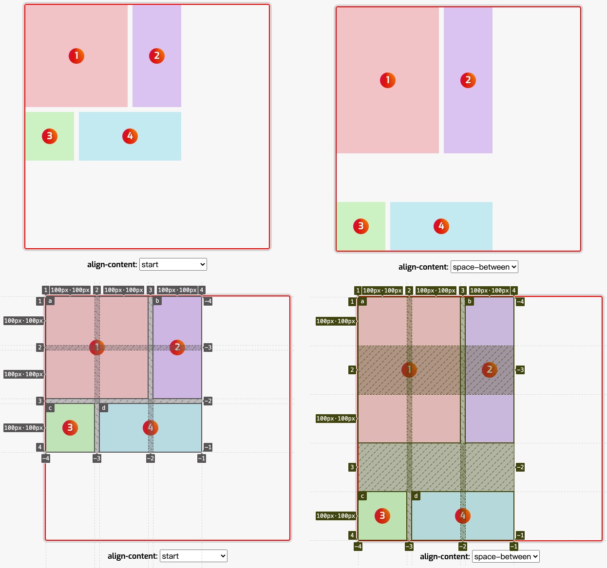
正如上图所示,网格容器的块方向的列轴和文本方向的行轴都有剩余空间200px(500 - 300)。
先在网格容器上设置align-content:
调整algin-content的值,将看到的效果如下:

在上面示例上稍加调整,加上grid-template-areas,并且让每个网格项目在指定的网格区域中:
.grid__container {
    display: grid;
    grid-template-columns: repeat(3, 100px);
    grid-template-rows: repeat(3, 100px);
    grid-template-areas:
        "a a b"
        "a a b"
        "c d d";
    height: 500px;
    width: 500px;
    gap: 10px;

    --align-content: start;
    align-content: var(--align-content);
}

.grid__item:nth-child(1) {
    grid-area: a;
}

.grid__item:nth-child(2) {
    grid-area: b;
}

.grid__item:nth-child(3) {
    grid-area: c;
}

.grid__item:nth-child(4) {
    grid-area: d;
}
align-content取不同值效果如下:

你可能已经发现了,这些与分配空间有关的值会使网格项目变大。如果网格项目跨越了多于一条网格轨道,因为轨道的间隙变大了,所以网格项目也变得更大了。因为精确尺寸的网格较为常用,所以如果你决定使用这些值,一琮要确保其中的内容能够适应多出来的空间,或者在使用这些属性值时,把项目的对齐设置为对齐到起点(start),可能会比设置为拉伸(stretch)更好。
就拿示例中的align-content取值为 start 和 space-between来作对比吧。其中网格项目i1和网格项目i2,它们都跨越了两条行轨道,右侧的图因为增加了轨道间距,所以它们占据的空间变大了。
justify-content和align-content类似,不同的只是设置网格轨道在网格容器文本方向的行轴对齐方式。比如:
.grid__container {
    display: grid;
    grid-template-columns: repeat(3, 100px);
    grid-template-rows: repeat(3, 100px);
    height: 500px;
    width: 500px;
    gap: 10px;

    --justify-content: start;
    align-content: var(--justify-content);
}
效果如下:
justify-content 取不同值的效果如下:

对齐和自动外边距
还记得 Flexbox 布局中 Flex项目使用 margin 为 auto的效果:

这种方式也可以用于网格项目中。也能达到相似的效果。比如:
.grid__container {
    display: grid;
    grid-template-columns: repeat(3, 100px);
    grid-template-rows: repeat(3, 100px);
    grid-template-areas:
        "a a b"
        "a a b"
        "c d d";
    height: 500px;
    width: 500px;
    gap: 10px;
}

.grid__item:nth-child(1) {
    grid-area: a;
    margin-left: auto;
}

.grid__item:nth-child(2) {
    grid-area: b;
    margin-right: auto;
}

.grid__item:nth-child(3) {
    grid-area: c;
    margin-top: auto;
}

.grid__item:nth-child(4) {
    grid-area: d;
    margin-bottom: auto;
}
效果如下:

你可能已经想到了,在 CSS 网格布局中,如果你希望某个网格项目在网格区域中垂直居中,除了使用 place-self之外:
.grid__item {
    place-self: center;

    // 等同
    align-self: center;
    justify-self: center;
}
还可以在网格项目中使用margin: auto让网格项目水平垂直居中:
.grid__container {
    display: grid;
    grid-template-columns: repeat(4, 100px);
    grid-template-rows: repeat(4, 100px);
    grid-template-areas:
        "a a b b"
        "a a b b"
        "a a b b";
    height: 500px;
    width: 500px;
    gap: 10px;
}

.grid__item:nth-child(1) {
    grid-area: a;
    place-self: center;
}

.grid__item:nth-child(2) {
    grid-area: b;
    margin: auto;
}
网格项目i1和i2用了两种不同的方式,分别让网格项目在把对应的网格区域(a和b)水平垂直居中:

网格布局中的间距
在 CSS 网格布局中的间距指的是网格轨道与网格轨道之间的间距,即列间距或行间距,它有一个专业的术语,叫沟槽。可以在网格容器上显式的设置 row-gap 和 column-gap 来指定网格轨道之间的间距:
row-gap:指定行与行之间的间距column-gap:指定列与列之间的间距
这两个属性都接受相同的值,即 normal 和 <length-percentage>,但fr单位不能用于gap属性中。
我们来看一个简单的示例:
.grid__container {
    display: grid;
    grid-template-columns: repeat(4, 1fr);
    width: 100%;

    --row-gap: 10px;
    --column-gap: 10px;
    row-gap: var(--row-gap);
    column-gap: var(--column-gap);
}
调整示例中的滑块,你可以看到相应的行间距和列间距会做出调整:
row-gap 和 column-gap 有一个简写属性 gap:
gap: row-gap column-gap
如果gap第二个值column-gap省略不写的话,则和 row-gap值相同,即行和列轨道之间的间距相等。
注意,有三个老的属性(只属于 CSS 网格规范中的):
row-gap对应grid-row-gap,行轨道间距column-gap对应grid-column-gap,列轨道间间距grid-gap对应gap
虽然有三个对应的新属性替代,但它们依旧在网格布局中生效。
特别要注意的是,用于网格轨道对齐的属性 justify-content 和 align-content 将会影响gap值的大小。
由于gap只接受两个值,只能设置行间距和列间距,并且所有行间距和列间距都相等。在 CSS 网格布局中无法使用 gap(或它的子属性row-gap和 column-gap)为不同网格轨道之间设置不同的间距。但我们可以通过网格轨道尺寸来模拟间距,比如:
.grid__container {
    display: grid;
    grid-template-columns: 1fr 10px 1fr 20px 1fr 30px 1fr;
    grid-template-rows: 1fr 10px 1fr 20px 1fr;
}

.grid__item:nth-child(1) {
    grid-area: 1 / 1 / 2 / 2;
}

.grid__item:nth-child(2) {
    grid-area: 1 / 3 / 2 / 4;
}

.grid__item:nth-child(3) {
    grid-area: 1 / 5 / 2 / 6;
}

.grid__item:nth-child(4) {
    grid-area: 1 / 7 / 2 / 8;
}

.grid__item:nth-child(5) {
    grid-area: 3 / 1 / 4 / 2;
}

.grid__item:nth-child(6) {
    grid-area: 3 / 3 / 4 / 4;
}

.grid__item:nth-child(7) {
    grid-area: 3 / 5 / 4 / 6;
}

.grid__item:nth-child(8) {
    grid-area: 3 / 7 / 4 / 8;
}

.grid__item:nth-child(9) {
    grid-area: 5 / 1 / 6 / 2;
}
正如示例效果所示,虽然使用网格轨道尺寸可以模拟出不同的网格轨道之间的间距,但这样做相对而言非常的麻烦,而且可控性差:

除此之外,还可以在网格项目中使用 margin 来设置,不同的是,网格项目设置margin 是用来控制网格项目的边缘和网格区域之间的边缘:
.grid__container {
    display: grid;
    grid-template-columns: repeat(4, 100px);
    grid-template-rows: repeat(4, 100px);
}

.grid__item {
    margin: 10px;
}
效果如下:

margin在网格项目中的使用和其他地方使用相似,但不会有垂直方向的margin重叠:
.grid__item {
    margin: 10px 20px 30px 40px;
}

另外,网格项目中的margin和网格容器上的gap可以同时使用,增更大的增加网格项目之间的间距,但他们各自作用是有区别的:
gap是用来设置网格轨道之间的间距margin是用来设置网格项目外侧边缘和网格区域边缘之间的间距
比如:
.grid__container {
    display: grid;
    grid-template-columns: repeat(4, 100px);
    grid-template-rows: repeat(4, 100px);
    gap: 10px;
}

.grid__item {
    margin: 10px;
}

规范中提供了一张图,描述了 gap 和 margin 分别使用和同时使用的效果:

小结
在今天这篇访问中主要和大家探讨了网格布局中的对齐方式(即 Box Alignment 在 CSS 网格布局中的使用),以及网格轨道之间的间距,网格项目之间的间距等相关知识。接下来将和大家再探讨网格布局的等比缩放。感兴趣的的同学,请持续关注后续的更新。


